Research Led Collaborations
Basil Spence flats renovation, Canongate, Edinburgh


The project provided an opportunity to apply previous academic colour research– undertaken as part of the Colour Strategies in Architecture project with Haus der Farbe– to assist the architects by providing them with a set of hand-painted sample cards that were used to return the flats to the original colour scheme.
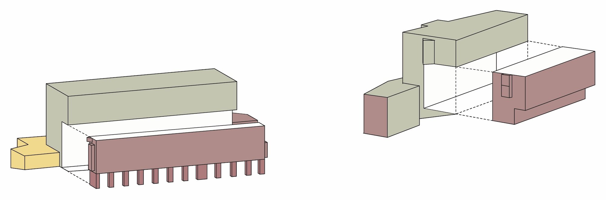
The original colour palette that had been used by Sir Basil Spence, Glover and Partners on the 1969 building is discussed in the Colour Strategies in Architecture book that shows both the palette and suggests that the colour was used in support of a tectonic reading of the architectural form.
The project, which acted as a pilot for energy retrofit of a listed building sited within the UNESCO World Heritage site, was funded by the Scottish Government through Scotland’s Energy Efficiency Programme and carried out in partnership with the City of Edinburgh Council.
in collaboration with John Gilbert Architects
Edinburgh World Heritage


Dementia Ward, Royal Edinburgh Hospital

Sited in the male dementia ward, the colour design was developed through a series of consultations with a range of users and installed together with student volunteers.
Colour is experienced as a complex combination of physiological sensing and cognitive interpretation. As cognitive capacity deteriorates, sensory experience of colour can be dulled. As the eyes grow dim, or yellow slightly in old age, the perception of space may also alter. The monotonous pale yellow walls used throughout the hospital make every space look similar and feel characterless. The colour design addresses this, and reflects the specific architectural and environmental context of each space. Rather than use architectural plans or computer visualisations, hand sketches proved to be very effective in communicating the conceptual ideas with small swatches of possible paint colours. The project aims to apply an emerging understanding on the role of colour within such environments to aid wayfinding and provide more varied, characterful spaces.
In collaboration with Artlink

Circulation area before installation
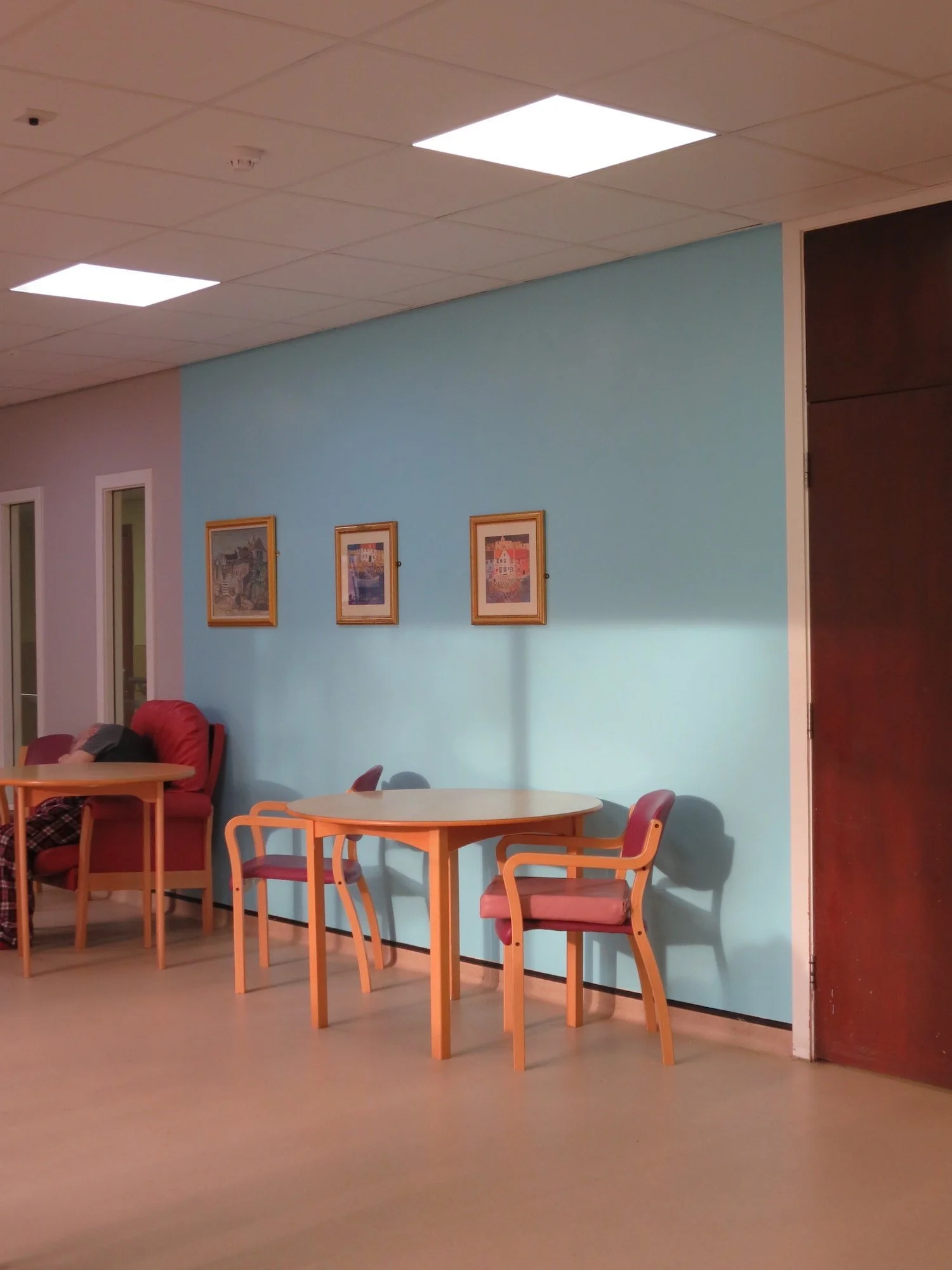


Colour for the Corridor, Royal Edinburgh Hospital


The colour design strategy defines a possible approach to introduce colour blocks to enliven a 150 metre long corridor that connects a series of buildings on the hospital site. The installations have been designed to enhance the experience and function of the spaces and to aid navigation. Unlike architectural design, the wall paintings have been installed by the author directly on the surface in fully occupied premises assisted by architecture students as part of a ‘live project’. The pilot project focussed on a reception space and three corridor spaces. The colour design was intended to be easily understood and was based on the colour of the seasons, drawing colours from the adjacent landscape and gardens.
Subsequent to completion of the pilot project, the hospital, led by the Arts and Greenspace Manager successfully rolled out the colour design strategy along the corridor themselves using colour swatches provided to them to stimulate discussion with the service users and staff. The effect has been transformational and warmly welcomed by the users and visitors.
in collaboration with Edinburgh and Lothians Health Foundation, now NHS Lothian Charity and research student, Dr Xuechang Leng.

Main hospital corridor before and after painting

Hope Park Counselling Centre

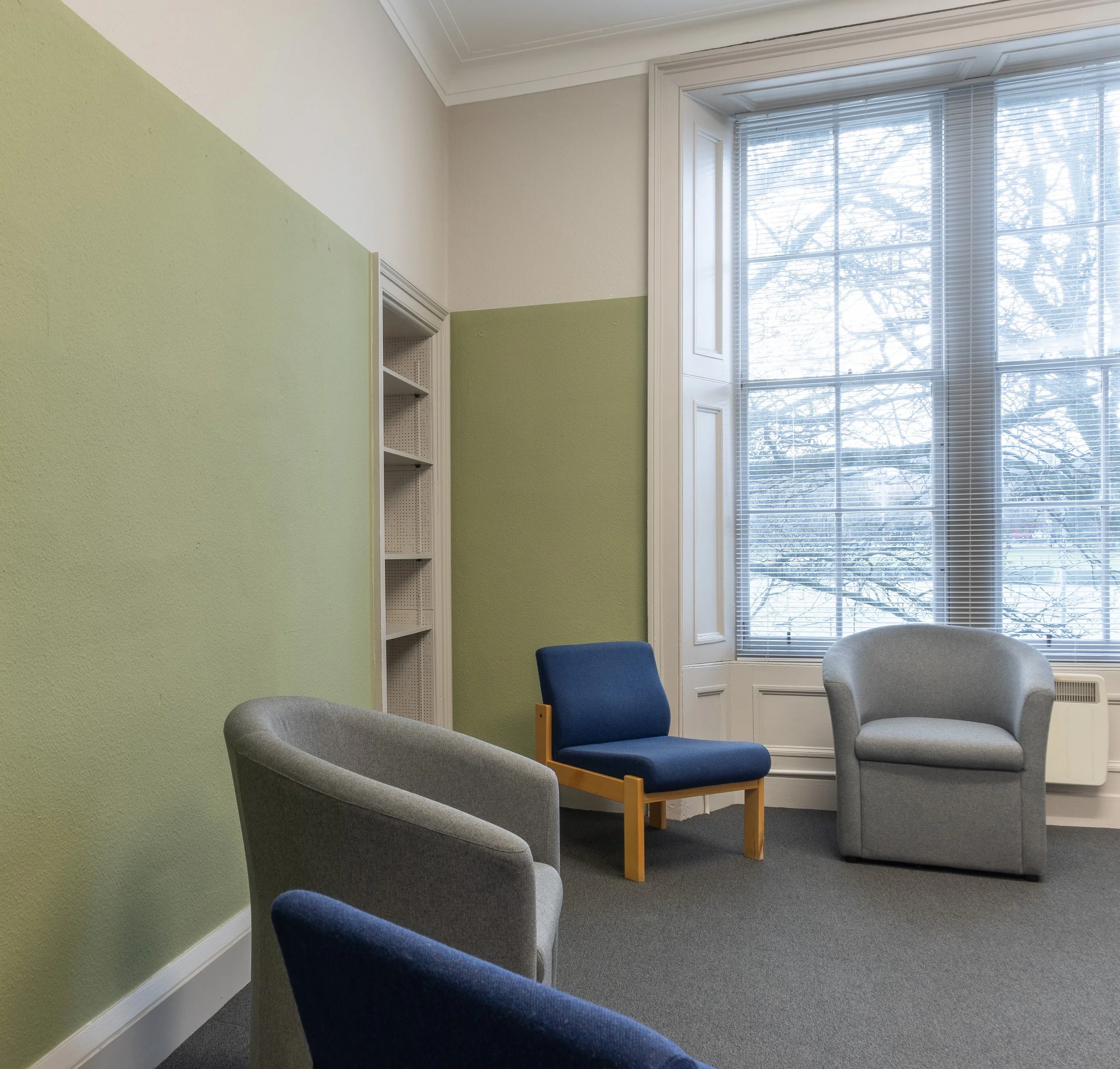
The project was intended to enhance the everyday experience of the building users. The clinic operates in a converted flat, which had been painted throughout in a mid-tone grey colour on all surfaces. The grey had been chosen to be restful, however the spaces subsequently felt very flat and under-stimulating. In discussion with staff, an overall colour design strategy developed to ‘wrap and fold’ areas of colour block to specific walls in the existing spaces.
The design approach intended to respect the ‘spatial practices’ of the counsellors and clinical psychologists in relation to the use of rooms. In most rooms, colour was located asymmetrically to allow the users choose where they will sit without dictating a particular layout. Some users may prefer to sit with their back to the colour, while others might enjoy the colour in their line of view. The colour will have a significant effect, experienced through peripheral vision, but the aim to is avoid being prescriptive or overwhelming to the users. The design approach allowed for unskilled volunteers to help by avoiding the need to work at height.
In a follow up project, working with an architecture student, Jamie Begg, and architecture workshop colleagues, we constructed an installation Breathing Space in a recess in one of the consulting rooms. The project uses a colour palette derived from Scottish landscape and invites the users to rotate the prisms to change the colour of the wall panel. It is also a means of distracting younger people during counselling sessions.


Cables Wynd House and Linksview House, Leith
A collaboration with the architects for a proposed retrofit project in Leith, Edinburgh, has provided an opportunity to develop a research-led colour design for two, Category A listed, housing blocks. The 1967 flats, originally designed by architects Alison and Hutchinson and Partners and are key examples of Scottish brutalist housing. The larger of the two blocks, Cables Wynd House, has a distinctive curving form leading to its nickname of the ‘Banana Flats’. The project is primarily focussed on addressing fuel poverty through a whole block, energy led retrofit.
The proposed colour palette for the Leith project uses colours derived from observation of the local context. The colour strategy emerged through a series of paintings from small abstract studies using the proposed palette, to an abstract painting that draws attention to the diverse people who live and have lived in the flats. The fabrics of the Scottish-based, 1960s designer, Bernat Klein, then offered a way of thinking about how colour could be used thematically in the composition. In relation to the distribution of the colours, multiple configurations were tested through hand-made abstracted collages to facilitate discussion. Further collages draw on the textiles of Anni Albers to investigate possible rhythms and visual movement across the flat façade to the rear of the blocks.
In collaboration with Collective Architecture
Colour Strategies in Architecture
with Haus der Farbe, Zurich

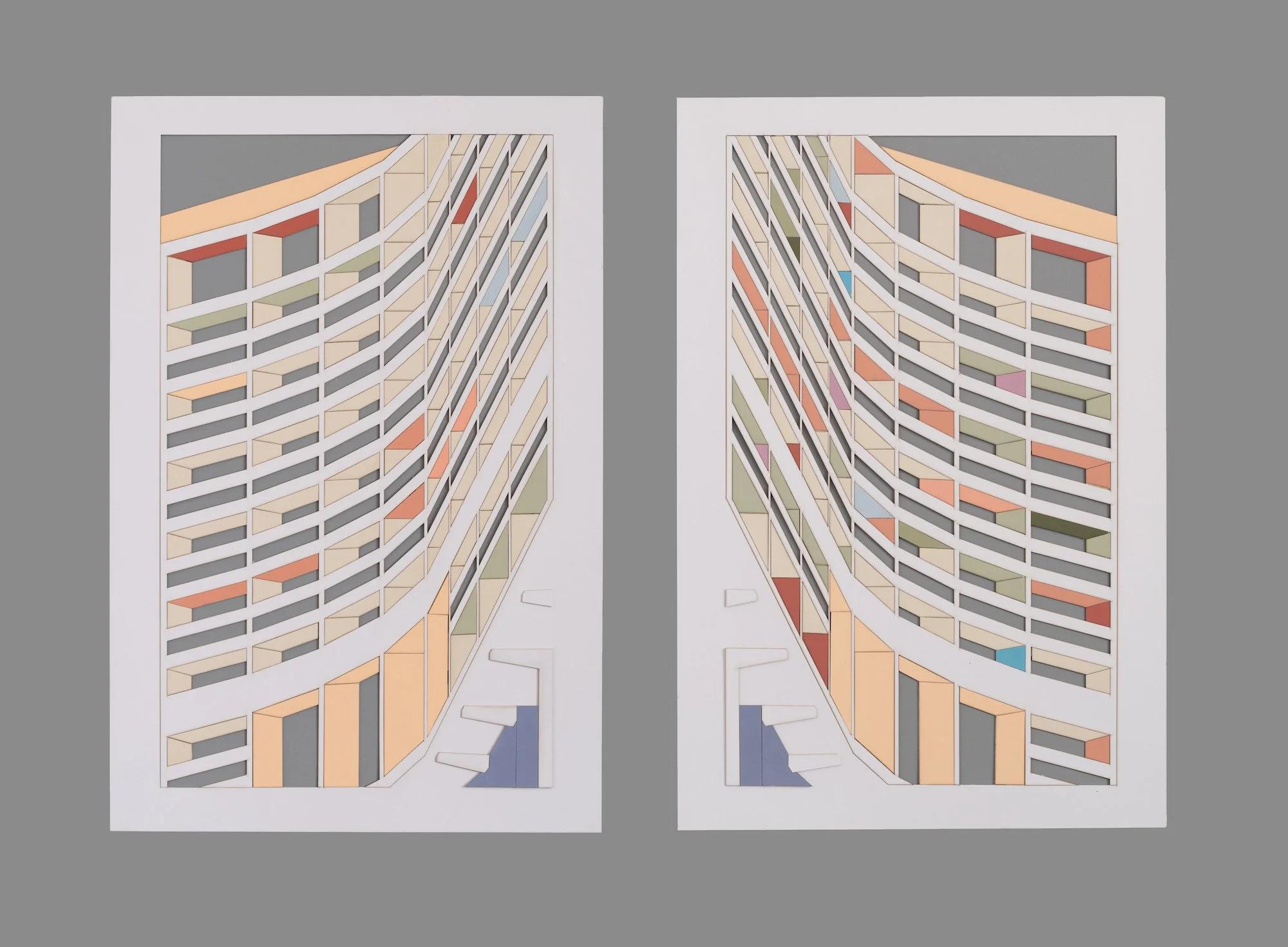
The project was a four-year, international interdisciplinary research collaboration between the Haus der Farbe, Zurich and the University of Edinburgh, which led to the publication of a book - Colour Strategies in Architecture (also published in German Farbstrategien in der Architektur) and an exhibition in eleven venues around the UK and Europe.
Drawing on examples from the 20th and 21st centuries, six different strategies for working with colour in architecture were presented on the basis of buildings in Berlin, Zürich and Edinburgh under the following titles:
Painterly Promenade (Lux Guyer, Zürich)
Tectonics Clarified (Basil Spence, Edinburgh)
Immersive Pop (Rainer Rümmler, Berlin)
Holistic Interplay (Hans Scharoun, Berlin)
Hushed Tonalities (Reiach & Hall Architects, Edinburgh)
Second Layer (Knapkiewicz & Fickert, Zürich)
Over 350 colours observed in the projects were replicated in hand-mixed and hand-painted samples and were presented through abstracted, collages of ‘building portraits’- that show the proportion, palette and use of colour on specific buildings, and ‘visualisations’ - that aim to communicate possible alternatives for a strategic use of colour in architecture.

For the London exhibition at the Architectural Association, small absract icon images of selected projects were developed.